Literacy + Art = A Perfect Marriage
How art teachers can marry art & literacy without sacrificing either.
Part #1: Letter Formation & Typography
In one of my first interviews to become an art teacher, a principal asked me, “How will you integrate literacy into your curriculum?” To be honest, as an ideaIistic, enthusiastic and (sometimes overly) passionate art teacher, the question offended me. I remember thinking (and definitely not saying), “Are classroom teachers asked how they’ll integrate art into their math or literacy curriculum? Are the arts standards not rigorous enough that we need to incorporate other learning objectives too? Isn’t art a valid enough subject to stand on its own?”
In the years since, these questions propelled a stringent advocacy for my subject. But the answers, like most things in life, emerged in somewhat of a gray area. Yes, art is valid, challenging and rewarding enough on its own merit but we are teaching art within a larger educational and societal context. And what better way to honor the ways in which “my” subject matter overlaps with others but to integrate all of it. Not all of the time and not in all ways but sometimes and in the right ways. I know now that infusing other subjects into the art studio doesn’t dilute what we’re teaching, but rather affirms the ways in which art is intrinsically connected to everything else.
And here is where literacy meets art. There are many ways in which this symbiotic relationship thrives but the ones with which we’ve had the most success, are in early elementary grades and focus on typography: which in the homeroom classroom equals letter formation and letter recognition with a dash of creativity.
Here are 2 of our greatest literacy & art projects below:

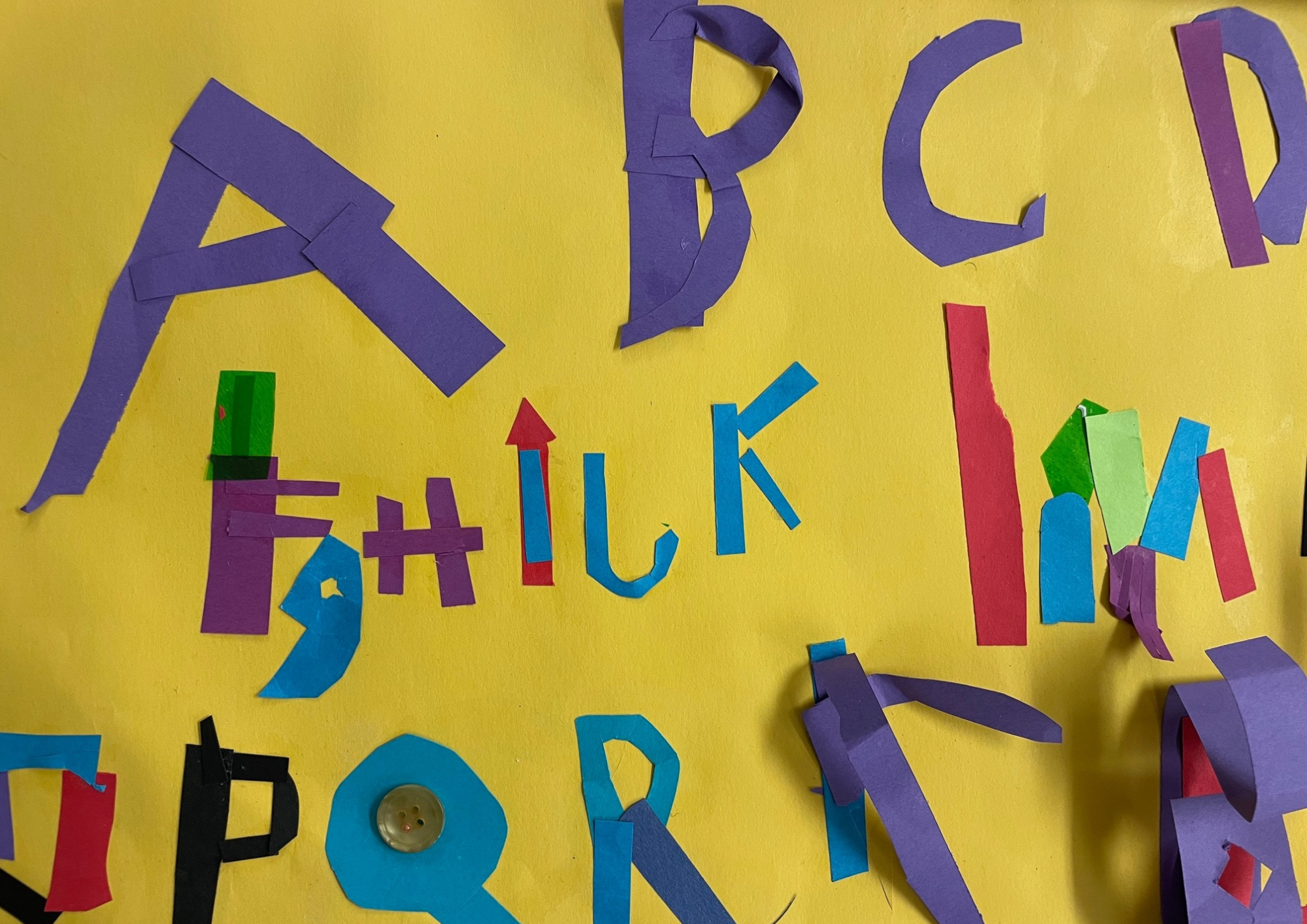
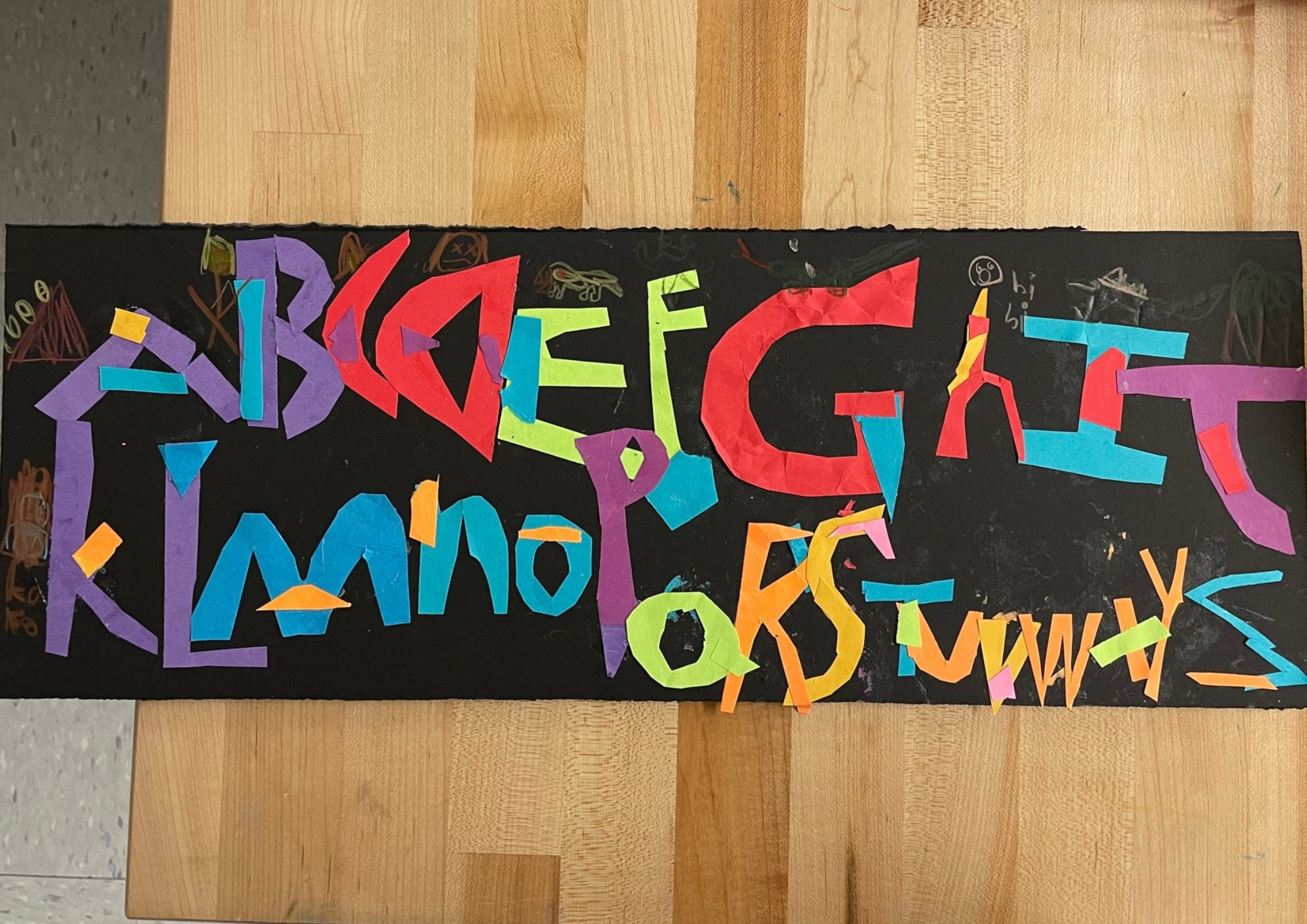
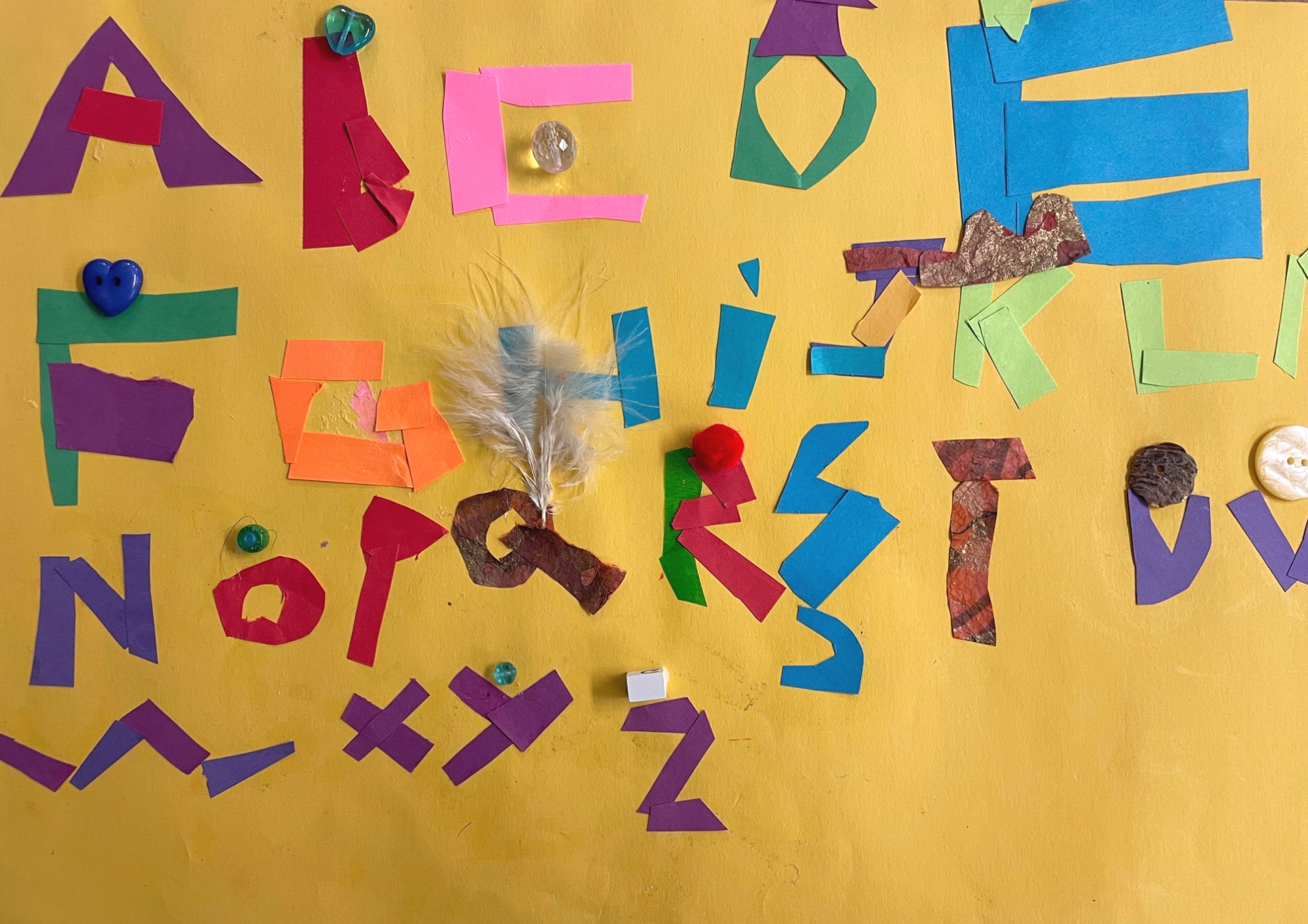
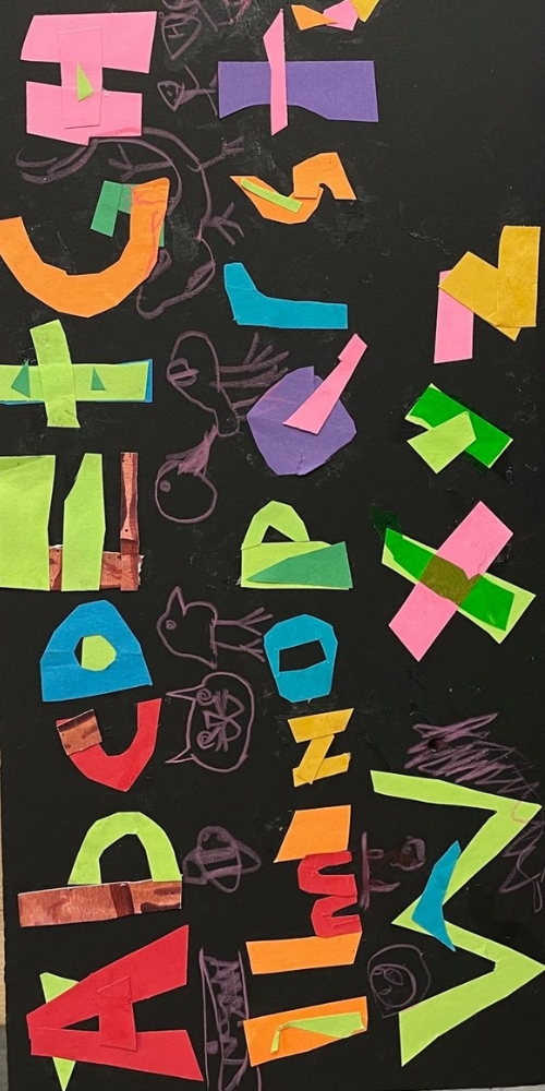
Collage Alphabets
What: Artists use cut strips of paper to assemble each letter in the alphabet.
Who: Grades K/1
Materials: Colored strips of paper, glue sticks, scissors, one large piece of construction paper for the background, drawing tools (for an extension drawing activity)
Relevant Vocabulary: Legible, stable, collage, assemble
Things to note: It takes time for young artists to complete their alphabets. Ours work on this for about 4-5 sessions. Keep them engaged by adding some “special papers” and introducing scissors in the 2nd lesson to encourage them to explore ripping. Also, expect a lot of letter “reversals”. This is developmentally appropriate for this age group and doesn’t need to be corrected.

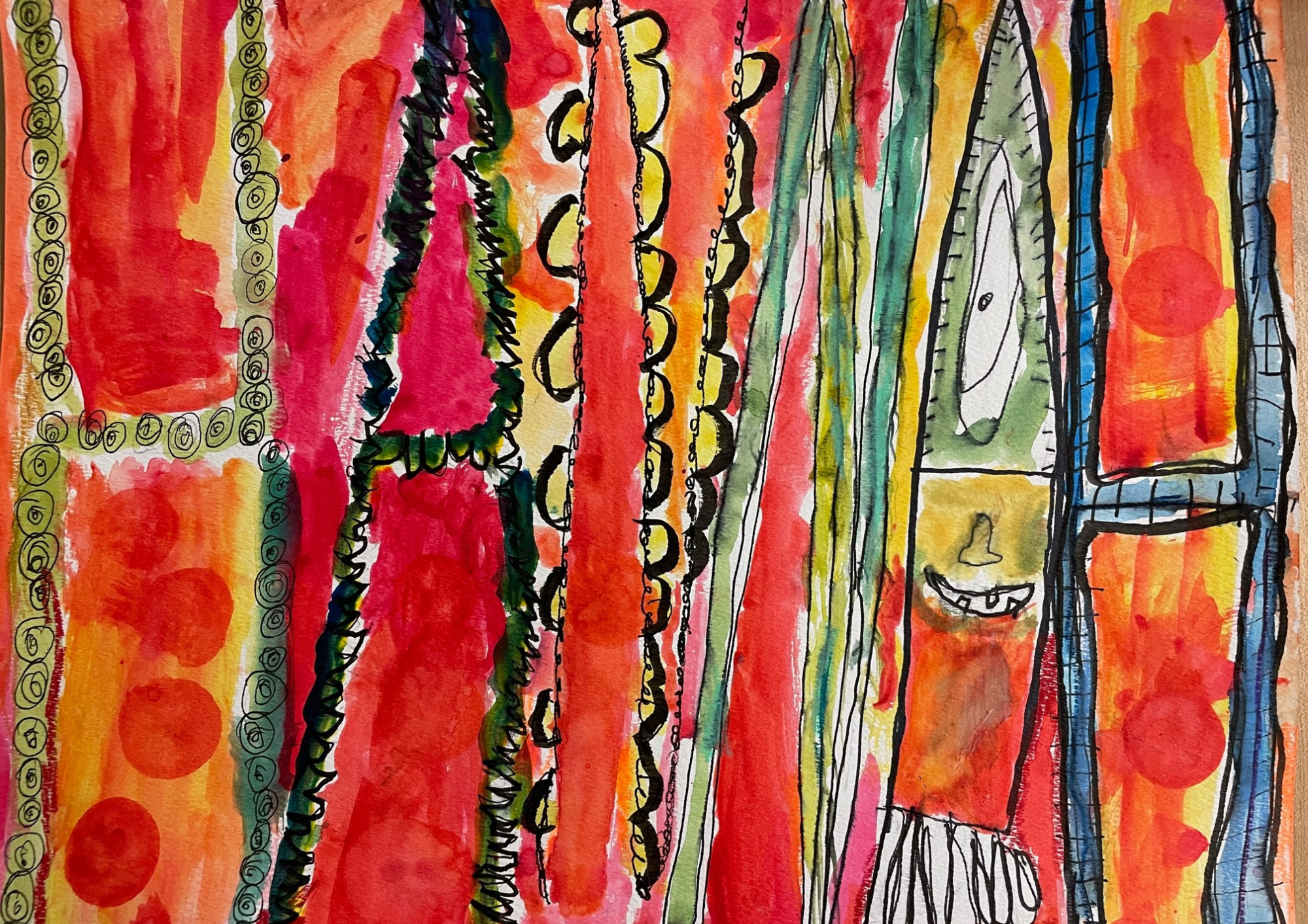
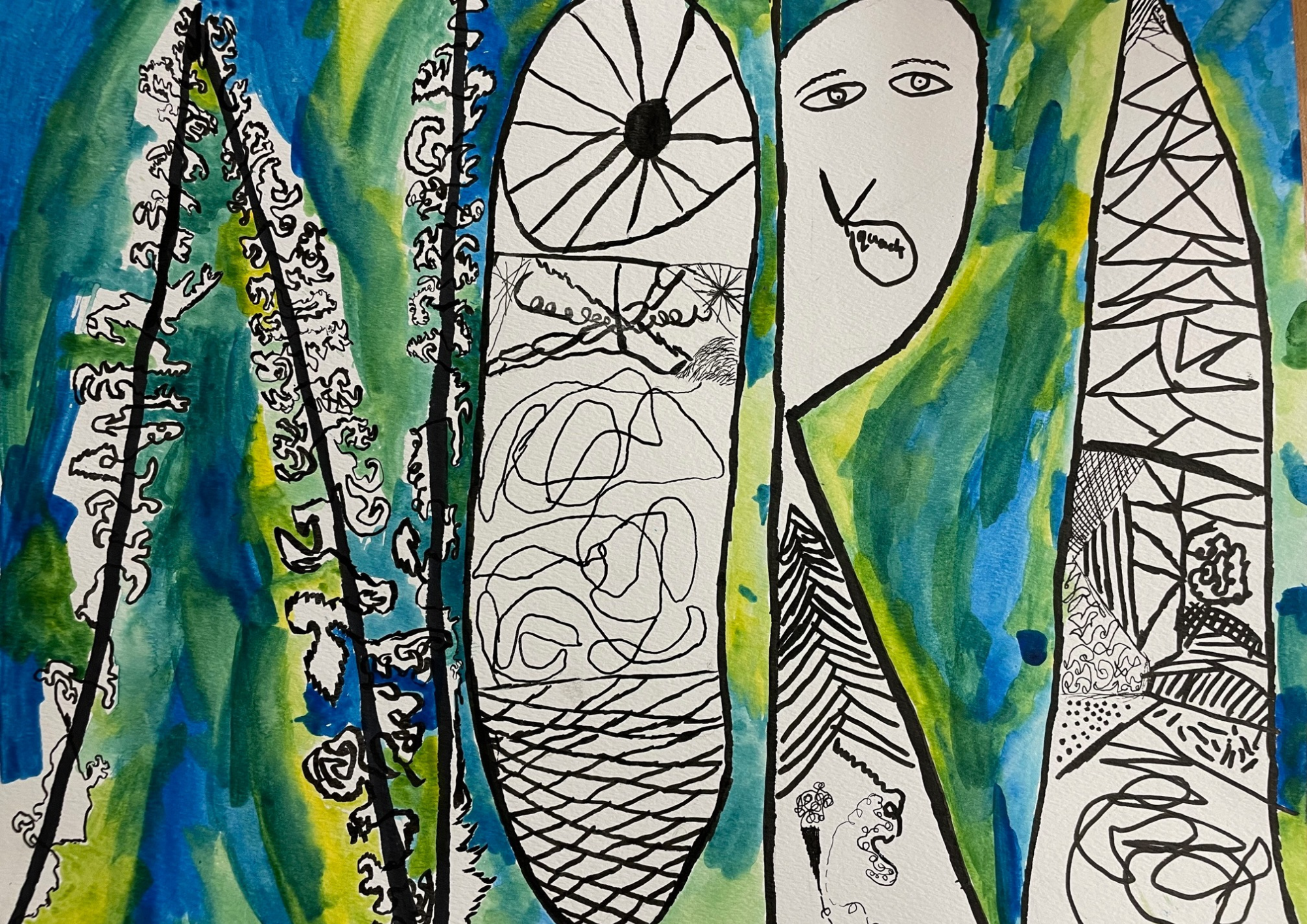
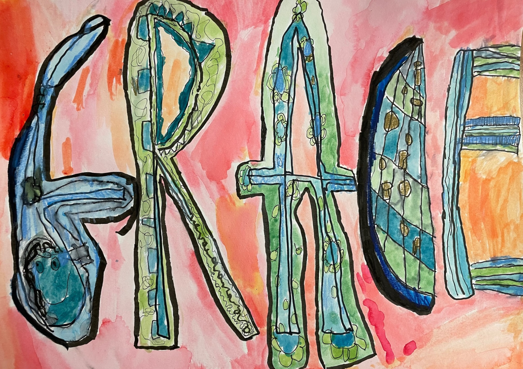
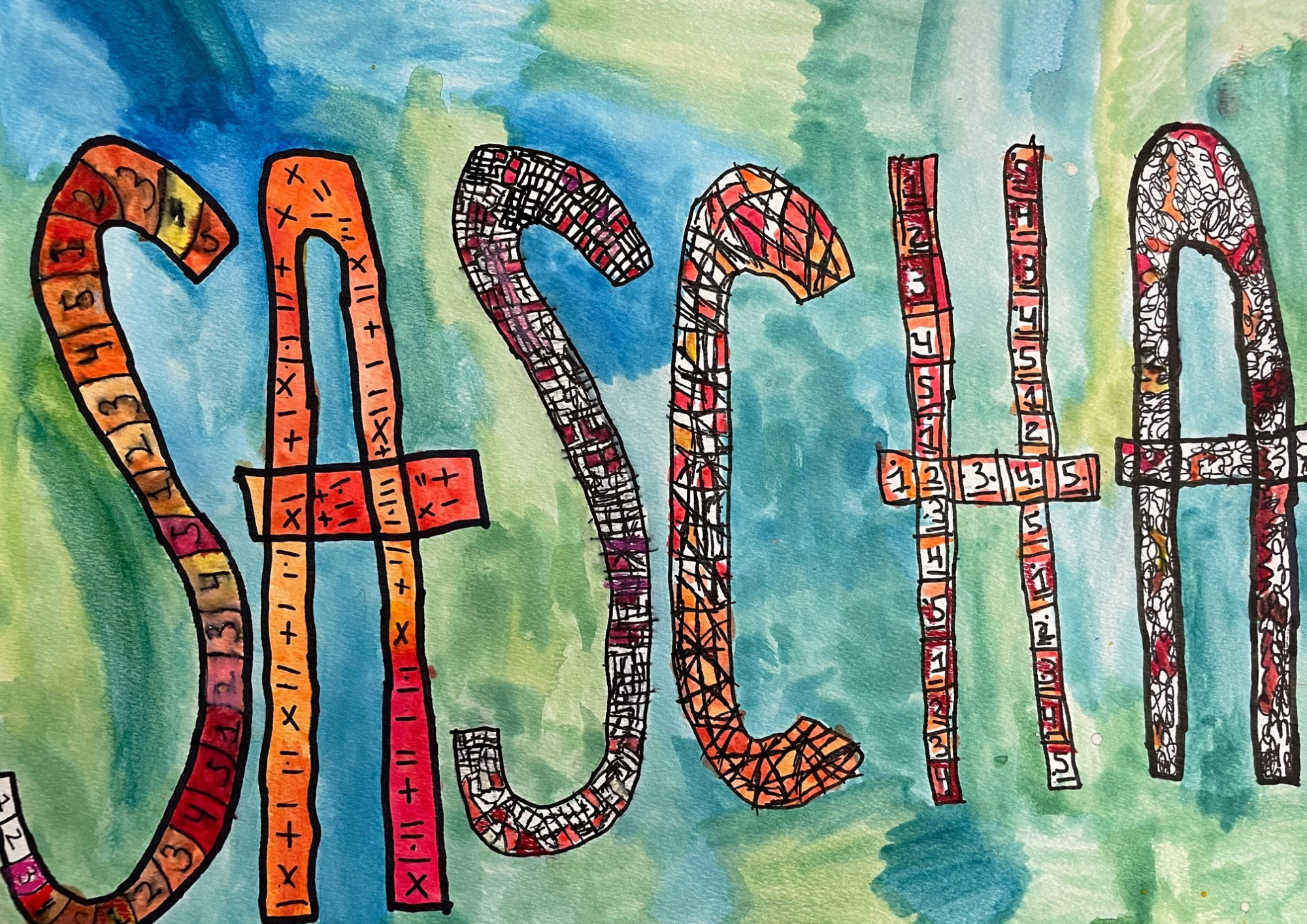
Name Drawings
What: Artists write their names in creative typography and using contrasting color families in the background and foreground.
Who: Grades 2-5
Materials: Watercolor paper, pencil, inking tools, paintbrush, palette, liquid watercolor, cups of water, colored pencils
Relevant Vocabulary: Typography, legible, composition, scale, warm colors, cool colors, contrast
Things to note: We typically have them explore typography by redesigning each letter of the alphabet as a precursor to this project. The most challenging part is making the letter both creative AND legible!